Of the many design trends that have come and gone in Singapore, it is perhaps least surprising that minimalism has taken a foothold here, especially in the building and interior scene. After all, in a city where space often comes at a premium, prioritising intentionality and purpose over quantity is a helpful way to make the most of smaller dwellings without adding unnecessary bulk. Even in bigger homes, keeping things to exactly what is needed can create a lighter feeling space for a cooling effect in the muggy climate.
It might be tempting to assume that designing a minimalist home is a cakewalk compared to other design styles, but that is by no means the case in reality. “Minimalism actually comes with a higher level of challenge,” says Tan Yue Wei, principal architect at YWA Studios. “When it’s visually simple, the slightest mistake is very visible.” Everything, he adds, becomes more prominent in a minimalist home, from the placement of the lights to how the carpentry is aligned.

The idea of paring back a design to its bare essentials is hardly a novel or contemporary one, but it’s no doubt gained a foothold in recent years. That’s not to say that the look is dated or no longer fresh, though. In fact, the bareness itself is a key factor in the timelessness of minimalism: the lack of “extra” pieces means there are fewer things that can be used to date a space. Those additional things can be added and removed as they go in and out of fashion, but the bones remain relevant through the seasons.
And there has certainly been some evolution in the style over the years. Today’s minimalism takes the unadorned, geometric fundamentals of brutalism — an aesthetic that emerged in the postwar 1950s — and takes them to another level with modern materials, millennial-motivated mindfulness and a strongly user-centric approach to design.
In other words, a minimalist building in this day and age isn’t just about slapping raw concrete on a plain rectangle; it’s about getting everything just right, exactly where it needs to be, with as few additions as possible to achieve a perfect balance for the people who will live there. Think of it as parkour for interior designers, whose goal is to create an inviting and aesthetically pleasing living environment in as few steps as possible.
A great gradient
The YWA team recently worked on the architecture and interior design of Maison Forteresse, a semi-detached house in Telok Blangah that embraces a minimalist aesthetic. The name, which means “fortress house” in French, was inspired by the project’s strong facade, mainly comprising a large grey wall. Set against the surrounding homes’ more typical looks, this exterior stands out strongly; it’s stark and powerful in its simplicity.

Tan says the idea came about because the owners like privacy, noting they “wanted a very solid frontage”. The wall was thus envisioned as a direct solution to ensure they could go about their day in peace. At the same time, says Tan, the owners are fans of fashion, so a focus on timelessness was key during the design process. An inverted L-shaped cutout on the exterior wall reveals a pop of colour that breaks the coolness; it lights up at night, giving a warm glow that subtly hints at the look of what lies inside.
There’s something strikingly different about Maison Forteresse that becomes apparent once the front door swings open. In a typical home, one would expect to see just the surrounding fence or shrubbery when looking through the ground-floor windows. Here, however, gazing past the open floor plan living room gives a direct view of the back of the house, where the dining room is surrounded by a green canopy.
At this point, Tan explains that the house was built on a piece of sloped land. “It’s a whole storey lower at the back,” he notes. “With the rear being on a lower level, the trees actually grew to a certain height where the canopy is just at your eye level when you enter through the main door. So we wanted to create a very through-and-through kind of visual experience for them.”
Another quirk of the house’s structure as a result of its sloped site is a balcony that extends from the living room. Looking up from here, one can see an airwell that is perhaps one of the most unique features in Maison Forteresse. Extending up three floors and culminating in a skylight, the airwell enhances that sense of lightness and openness seen in the living room. Rounded edges, framed by recessed lights and varied in shape from floor to floor, add a sense of playfulness and modernity.

“I was very afraid the client would reject it,” says Tan, highlighting that the airwell’s more organic curves deviated from the straight lines found throughout the rest of the house. But he says those curves have a purpose. “When you walk past it, it comes alive … it morphs and transforms as it goes up. We wanted it to be an icebreaker and a central point of the house.”
Zachary Tay, senior architectural executive at YWA, says the airwell not only serves as a “courtyard” for the house that can serve as a gathering area for those coming in; it also ensures good circulation, allowing for ventilation across levels to help keep things cool, even when the mercury rises.
Variety with subtlety
When it came to the interiors, the homeowners, who love travelling to Japan, approached the YWA team with reference images of minimalist Japanese homes; these sparked the inspiration for how Maison Forteresse would look.

Once inside, the influence of the fortress gives way to a contemporary and welcoming space. Of course, the look is still cohesive, with elements that tie the whole project together. Much like the exteriors, clean lines and high contrast in a neutral palette dominate here; light-toned wood-fluted walls meet dark panels and beige floor tiles in the living room, creating a mix that feels exciting yet remains cohesive. That high contrast also gives just enough visual interest so that few additional decorations are needed to make the space feel dynamic.
Past the living room are the dry kitchen and dining room. Floor-to-ceiling windows give a glimpse of the outside greenery, making it feel as if one is dining in a treetop setting. Light grey concrete-textured walls and floors in the dining room mark a departure from the deeper, contrasting hues elsewhere on the first floor; this allows light to bounce from outdoors during the day, brightening the space while keeping it sleek and neutral.

Down on the lower first floor, which was “created” by the slope, is an entertainment room that leads out onto a terrace and swimming pool. The entertainment room continues the sharp, contrasting tones of the living room, with dark timber-textured walls set against lighter flooring. “It’s like a man cave,” says Tay, adding that this is his favourite spot in the house, especially with the outside view of the pool and landscaping. “It’s where you can really relax.”

Upstairs are a master suite on the third floor, as well as a junior suite and three guest rooms on the second floor. For senior interior designer Siv Leong, the junior suite is where he feels the best of minimalism has been highlighted. “It’s a small, cosy room, and not too big where you see a waste of space,” he says, though it remains spacious enough for one to “make sense of the minimalism” without any feeling of clutteredness or crowdedness.
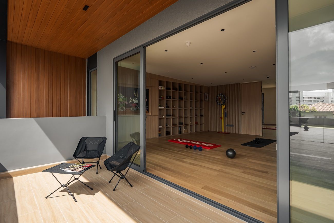
Capping off Maison Forteresse is an attic with a home gym that doubles as a study. While the rest of the house has generally been in darker tones, here it’s the exact opposite, with the space fully bathed in bright sunlight during the day, illuminating a range of pale-hued surfaces.

Surface strategy
To achieve the variety of surface colours and textures used throughout the house, the YWA team turned to laminates, specifically those from Lamitak. Leong says the brand’s products stand out among those by other laminate companies because of their range of unique prints that celebrate subtleties. “They’re okay with things just going softer [and not] having to be loud all the time.”
He adds that this quality makes it easy to apply the laminates over large surfaces, such as entire walls. It also allows for mixing and matching with a much lower risk of clashes. “We can put them all over the house and they’ll still feel like they merge with each other.” Having such combinations is key in a minimalist home, he adds, because it is a way to keep the eye entertained without adding bulk. “You can see different levels of colour and texture variation, which makes the space unique.”
In the living room, the YWA team used Anthracite Eames Teak; the dark-toned wood grain is understated enough to look good on a big wall, but retains just the right colour and texture to add a subtle warmth to the space, even with its deep hue. The same laminate was applied to several other surfaces in the house, says Leong.

Over in the dry kitchen, the island was made a rich shade of black with Santino L’ametlla; again, the subtle texture and roughness give the laminate character. Behind it, smooth Matte Black was applied to the cabinetry, striking a bit of contrast with the foreground of the space, while keeping within the same palette.
For the lightest-toned parts of the house up in the attic, meanwhile, the YWA team went with Ibiza Nogal laminates, with a pale walnut wood grain and matte finish that reflects light well without causing glare or harsh reflections.
Tan points out that when it comes to minimalist spaces, “there isn’t a lot to play with”. Surfaces are one major way homeowners can experiment with their interior designers. “Nowadays, there are a lot of different finishes, colours and textures that people can touch and feel,” Tan adds; these can help add a sense of a homeowner’s personality and taste.
Rethinking, not just removing
Another key part of taking a minimalist approach to design involves stripping away the non-essentials and the extraneous; for those more well-versed in Marie Kondo’s lexicon, it’s about getting rid of the things that don’t “spark joy”. But the solution isn’t always removing items for the sake of hyper-simplicity; reimagining ideas to make them feel essential or integrated in the space can also be part of a good minimalist design.
Though earlier renderings of the design for Maison Forteresse included a tree at the airwell, maintaining a tree would have proven too much work, so it was taken out of the final design, says Tan. “I think greenery is always one of the things that we want to inject into a house to [make it] more welcoming,” he continues, adding that homeowners are usually most concerned about maintenance when it comes to plants, including the effort required to take care of them and to clean up fallen leaves.
Still, they wanted some plants in the house, so they had to find a more effortless, efficient way around it. The solution came in the form of terraced planters along the external stairs leading from the first floor to the lower first floor, reducing the effort required to keep the plants healthy and tidy. Tan notes that the addition of plants here also helped to turn a space that is usually purely functional into one that is also aesthetically pleasing and better integrated with the house.
At the end of it all, minimalism is about thoughtfulness and mindfulness, with a focus on staying clean and lean. “A lot of homeowners come in with a lot of baggage,” says Tan. When dealing with things that have been accrued over the years or brought over from previous homes, it’s important to realise that such objects may no longer fit or be needed, he adds. “You need to think of what to let go of.” The idea, he concludes, is to earnestly and sincerely zoom in on what truly matters.

Check out the latest stories on Interior Inspiration


